Introduction:
The exploration of how colors affect people's feelings and actions is called color psychology.
Grasping the emotional impact of colors in UX/UI design can assist designers in creating visually pleasing and emotionally captivating user interfaces. This article will cover the basic ideas of color psychology and its connection to UX/UI design, highlighting how different colors can evoke various emotions and thoughts in users. It will also demonstrate how designers can use multiple colors in UX/UI design to reach certain objectives, like building trust or a sense of urgency. Additionally, it will touch on the importance of color contrast and accessibility in UI design.
1. Basic principles of color psychology:
The study of how colors affect our moods, emotions, and physical responses is called color psychology. Different colors can trigger specific emotions, like warmth, trust, or enthusiasm. For instance, red is often linked with energy and excitement, while blue is connected to calmness and peace. Research has shown that red can increase heart rate and blood pressure, while blue has a calming effect on the body.
According to a study published in the Journal of Environmental Psychology in 2002, people reported feeling more at ease and less anxious in blue rooms compared to red ones. Similarly, a 2011 study in the Journal of the Academy of Marketing Science found that the color red increased participants’ appetites and desire to eat.
Another example is the color yellow, which is known to evoke feelings of happiness, cheerfulness, and warmth. A study published in the Journal of Environmental Psychology in 2013 found that people living in yellow rooms reported feeling happier and less depressed than those in rooms of other colors.
Color psychology is a complex field, and the impact of color can vary based on factors such as personal experiences and cultural background.
2. Feelings stirred by various colors in UX/UI design:

“Color can be used to create visual cues that help users understand the relationships among the various elements on the page, making it easier to find what they’re looking for.” Don’t Make Me Think: A Common Sense Approach to Web Usability” - Steve Krug.
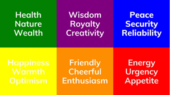
In UX and UI design, color helps make people feel certain ways and leads them through the design. Warm colors like red, orange, and yellow can make users feel warm, excited, and in a hurry. Designers often use these colors in buttons that call for action, important messages, and other places where they want to catch attention or make things feel urgent.

In contrast, calm colors like blue, green, and purple can make you feel peaceful, trusting, and safe. Designers often use these colors in places like login forms, contact details, and other spots where they want to create a sense of confidence and security.
Colors are useful for guiding users through a design. If a website or app uses the same colors throughout, it can make it simpler for people to explore. Giving buttons, links, and other things you can click on a different color can show users where they can do something. Colors can also be used to make certain information stand out more, catching users' eyes and showing them what's important
3. Color contrast and accessibility:
Having good color contrast is crucial in UI design because it really affects how easy it is to read and use an interface. When there's a strong color difference between the text and the background, the text becomes clearer and easier to read. This is especially helpful for folks with vision issues like color blindness or low vision. But when the color difference is low, reading text can be tough, and it might strain the eyes of everyone using the interface. This can make users unhappy and make it hard for them to get things done, possibly causing them to give up on the product.
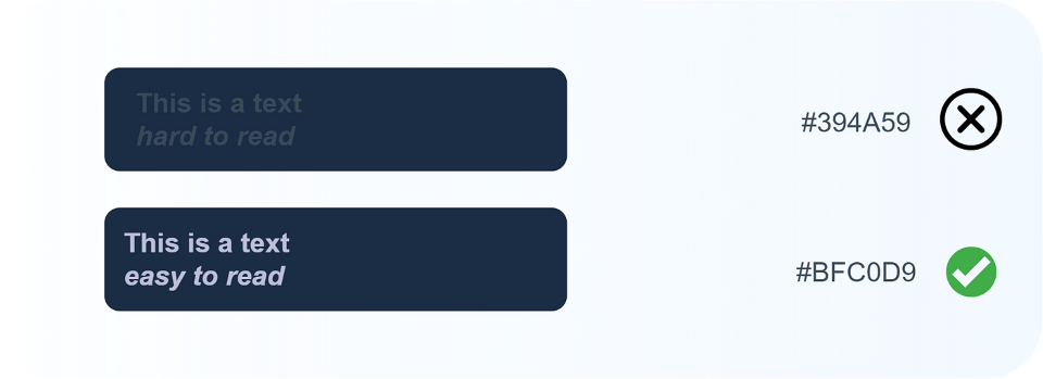
Designers can use tools like color contrast checkers to make sure their designs can be easily seen and understood by everyone. They can also test the interface with different users and get feedback to find any problems with readability or ease of use.
It's important to know that accessibility isn't just about color contrast; it's also about making the interface user-friendly for everyone. Other things to think about for accessibility include adding descriptions for images, making it easy to navigate with a keyboard, and providing audio explanations for videos. The interface should also work well with tools that assist people, like screen readers.
In summary, having good color contrast and making the interface accessible are crucial for creating designs that work for everyone, no matter their eyesight. This is a big part of inclusive design, making sure that everyone, no matter their abilities, age, gender, culture, or anything else, can use and enjoy an interface.
